If you consume any form of contemporary media, from digital channels such as websites and social media to conventional ones like magazines and TV, you can’t fail to have noticed that the logos of many big brands seem to be getting simpler. Embellishments, such as 3D styling, graduated colours and lighting effects are being removed to create flat graphics which are themselves also being rationalised into simpler shapes and typographic forms. If you haven’t noticed, here are a just few recent examples of the trend from various sectors starting with fast food.
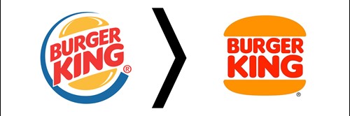
Burger King have ditched the elements that gave the logo a dynamic feel and sense of movement. The blue outer circle ‘swish’ has gone as has the angled type and bun in favour of simplified typography and a flat burger bun, which reverts back to something much closer to the logo they used from the ‘60’s to ‘99.
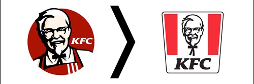
KFC have also stripped back their logo, which always featured Colonel Sanders, but now it’s reduced to just his head with a neck tie, no apron or shirt. He is presented in flat black and white, the skin tones, which also suggested shape have been removed and he’s been straightened up from his jaunty angle. They have introduced a new element which uses the bold corporate red colour, a key part of the brand, by cleverly using blocks to create the shape of their chicken buckets.
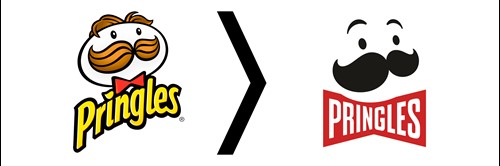
Moving onto consumer food products, the ever-popular party crisp Pringles have taken simplification to extremes by stripping it right back to only the most basic elements. Gone are the graduated colours in the moustache and hair, which has been shaved off completely. The text with 3D effect and drop shadow has been flattened and the font changed, then added into a new device which creates the bow tie. It may be a radical hack-back, but you the brand is still instantly recognisable.
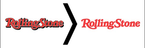
Such extensive surgery is an extreme example, sometimes it's just about cleaning a logo up. By removing the black drop shadows, which are both in and beneath the letters, and the white keyline to revert back to just the text, Rolling Stone magazine has made their logo much cleaner and more legible.
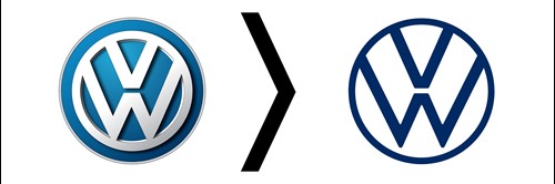
There a lot of examples in the automotive sector, which seems to have followed the trend en masse. Volkswagen have retained the stacked ‘VW’ letterforms and a blue colour but little else from their old logo with 3D effects, shadows and bezels all ditched for a very simple circle with just the ‘VW’ type in the old style but presented in flat graphics.
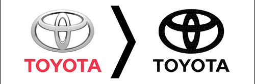
Toyota have followed a similar path by removing all 3D elements, shadow effects and bezels to adopt a flat logo which uses the same shapes and typography but again with flat graphics.
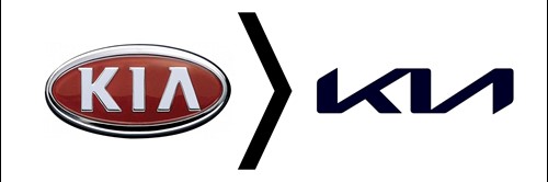
Arguably the biggest leap, but also the most effective, is Kia’s move away from a very cliched badge with all the 3D, shadow and lighting effects you can cram in, which always felt like it was trying to look like a Japanese manufacturer, onto a modern, clean and simple marque with nicely crafted and dynamic letterforms.
Perhaps even more so than many car manufacturers, a collective of fashion industry brands in which nearly all brands seem to have used the same designer, so similar are their new logos.
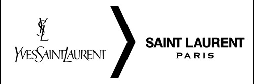
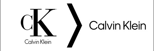
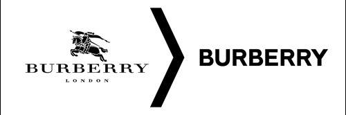
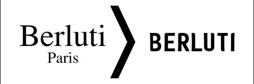
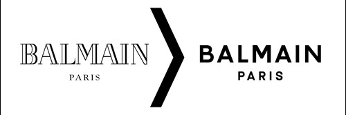
Whilst plenty of car manufacturers have stripped back their logos, it feels like the entire fashion industry has adopted very similar brands, so much so it’s almost like they’ve all used the same designer. These examples from Yves Saint Laurent, Calvin Klein, Burberry, Berluti and Balmain are almost identical featuring just bold, black sans serif fonts nearly all in caps to reduce their logos to just a label.
So what’s driving this move to simplification?
The number one factor is mobile first design and the need to a shrink a logo so it works in a one centimetre square - the app icon. It’s almost like graphics have reverted to the 2D look which was the norm before computers with graphics software made it easy to embellish designs and add effects like drop shadows, gradients, complex 3D renders and lighting effects. Technology also facilitated the reproduction of these sophisticated marques with increasing use of screens in marketing, from websites to smartphones, which are obviously high resolution and full colour. Printing too has benefited from advances in technology. Formerly printing costs rose when more colours were used up to full colour [4 inks] and then there were ‘specials’ such as metallics. So it was more cost effective to keep a logo down to a couple of colours when printing thousands of letterheads. Digital printing, from in-office colour lasers and inkjets up to commercial presses, made full colour printing viable all the time. All these innovations are irresistible to many designers, and they do allow you to create some pretty cool effects, but sometimes it dilutes the impact of the design itself and should be challenged anyway. Now it’s all about ‘pixel pressure’ and there’s simply no room for gratuitous or over elaborate effects.
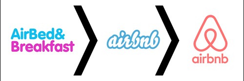
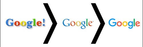
Secondly, it’s about maturity and simply growing up. The biggest brands in the world are now mostly technology businesses that have only emerged in the last few decades but have grown rapidly to overtake many traditional brands, which have generally been honing their brand identities over many years to become more sophisticated. The speed of growth in the technology sector has seen the life of their brands compacted into much shorter timeframes leading to more and faster changes. it should be noted that many of the founders of these businesses were also much younger than your average business magnate, many just graduates, which might account for the immature, cartoonish or even whacky logos they adopted. As these businesses have matured, so have their brands to become corporate symbols more befitting of their multi-billion dollar stock market valuations, as these examples from Air BnB, Go Daddy and Google illustrate.

Thirdly, there’s a need for big brands in particular to extend as they diversify. There are many ways to approach diversification strategically, and sometimes, for example with acquisitions, the brands form part of a family which retain the individual brand identities. A good example would be Unilever which owns dozens of consumer brands which are instantly recognisable which adds value, and is too valuable to risk changing. However, some corporates decide to build on one overall brand identity with sub-brands for each division, or service offering such as Warner Brothers which followed the simplification theory by ditching the shimmering gold styling and 3D effects to adopt a much simpler one colour shield for its core brand. This approach makes it much easier to adapt it for any number of sub-brands by simply changing colours and adding its name.
Finally, trends are cyclical. Fashions come and go. Maybe a return to simpler 2D or ‘flat’ designs is a natural evolution and at some point there may be a move back towards the use of more decoration again. Perhaps one of the big brands might seek to stand out from the crowd of all these flat designs by reintroducing effects which could, in turn, prompt some copycats. However, the pressure of making a brand identity work at a small size will remain, so any logo needs to take this into consideration at least. Whatever happens with trends and fads, the principles of good design are consistent. Less is more. If it doesn’t need to be there, it probably shouldn’t. All these examples illustrate this as the simpler versions are always visually stronger, bolder and so much easier to identify with all the clutter removed.
“Good design is as little as possible. Less, but better because it concentrates on the essential aspects. Back to purity, back to simplicity.”
Deiter Rams