
Serif or sans serif? That is the (slightly interesting) question (not just for typographers).
At the beginning of 2024 we were approached to get involved with an AI start up to design their brand, to provide marketing support and collateral. It was an exciting opportunity given all the buzz around AI, which has increased exponentially since then of course. AI was an even more shiny new thing a couple of years ago than it is now, so we were delighted to support it, both for the work, but more for the exposure to the new technology and the learnings we could take.
The founder, who had a PHD and many years of experience in technology, specifically in Machine Learning, was undoubtedly a very knowledgeable and very clever guy. There were some initial questions, such as his business background which included several start ups, most of which seemed to have been consigned to history, but it's often the way in tech - fail fast and learn they say. And there was a very experienced board for the business which was completely comprised of men in their fifties and sixties in a field dominated by graduates and bright young things. However, it was explained that the main purpose of the board was to raise seed capital and that finding a couple of million of investment for an AI business would be as easy as falling off a log. This was the first of an increasing number of ‘red flags’ as it turned out to be somewhat harder than predicted to raise the investment money, leading to an approach for those involved to invest in shares. Red flag number 2.
Red flags 3 and onwards mostly related to the founder, who was developing the software himself with the support of a single developer in India. There were frequent update meetings, but many deadlines fell by the wayside and then goal posts moved around all over the place as focus shifted from platforms to agents and back again. However, we were constantly assured that things were progressing well and, even though we’d not seen anything that actually worked, the software was in fact 'better than Google’s'. Delivery of a truckload of red flags. On subsequently checking, it turns out that Google employ some 5,000 to 6,000 software engineers who work on AI, some of whom are on salaries of well over a million dollars. Which begs the question that if he was that clever, wouldn’t he upsticks from a semi in Stockport, relocate to San Francisco and earn mega bucks? More importantly, it also made you wonder how one brain could achieve more than thousands of MIT grads, but this was summarily dismissed in a meeting when he actually described himself as a genius. Final big red flag.
During the time we worked together it became apparent that the founder’s ‘genius’ was not limited to his own specialism as he apparently knew best about pretty much everything. This included design and branding. We had designed a brand identity that was universally praised by every one involved, so it was quickly rolled out and a brand guidelines developed.
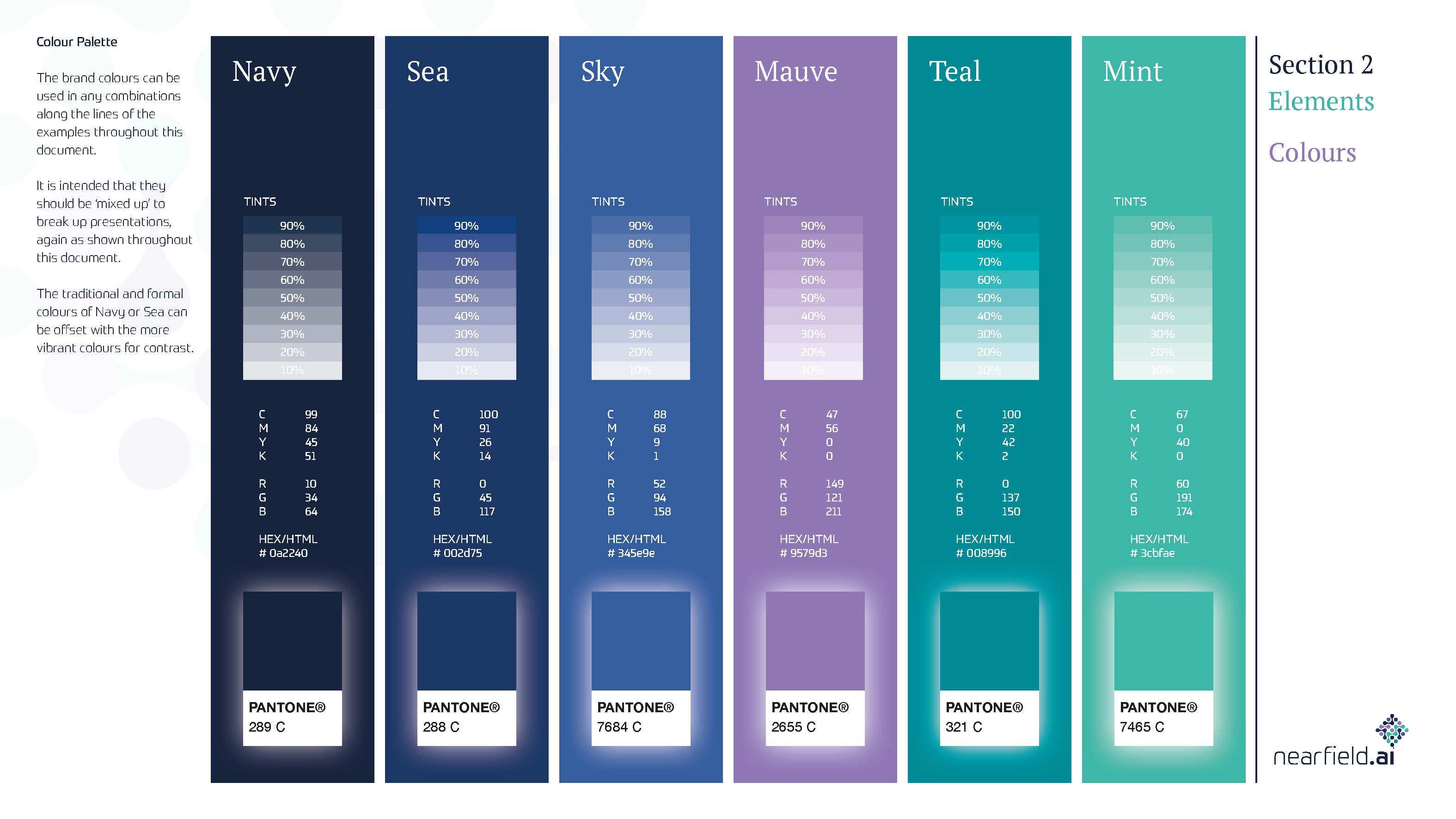
The guidelines included quite a broad colour palette ranging from a navy blue, sea and sky blue, mauve, teal and mint. They were all complimentary hues that sat well together but could be used individually, with the darker colours bringing a more serious feel and the brighter ones a fresher vibe to be used as appropriate for a specific scenario. Colour is of course subjective (although there is acceptance around the psychology of colour) but despite the flexibility of the palette and the approval of everyone else, the founder became increasingly obsessed with changing the colours.
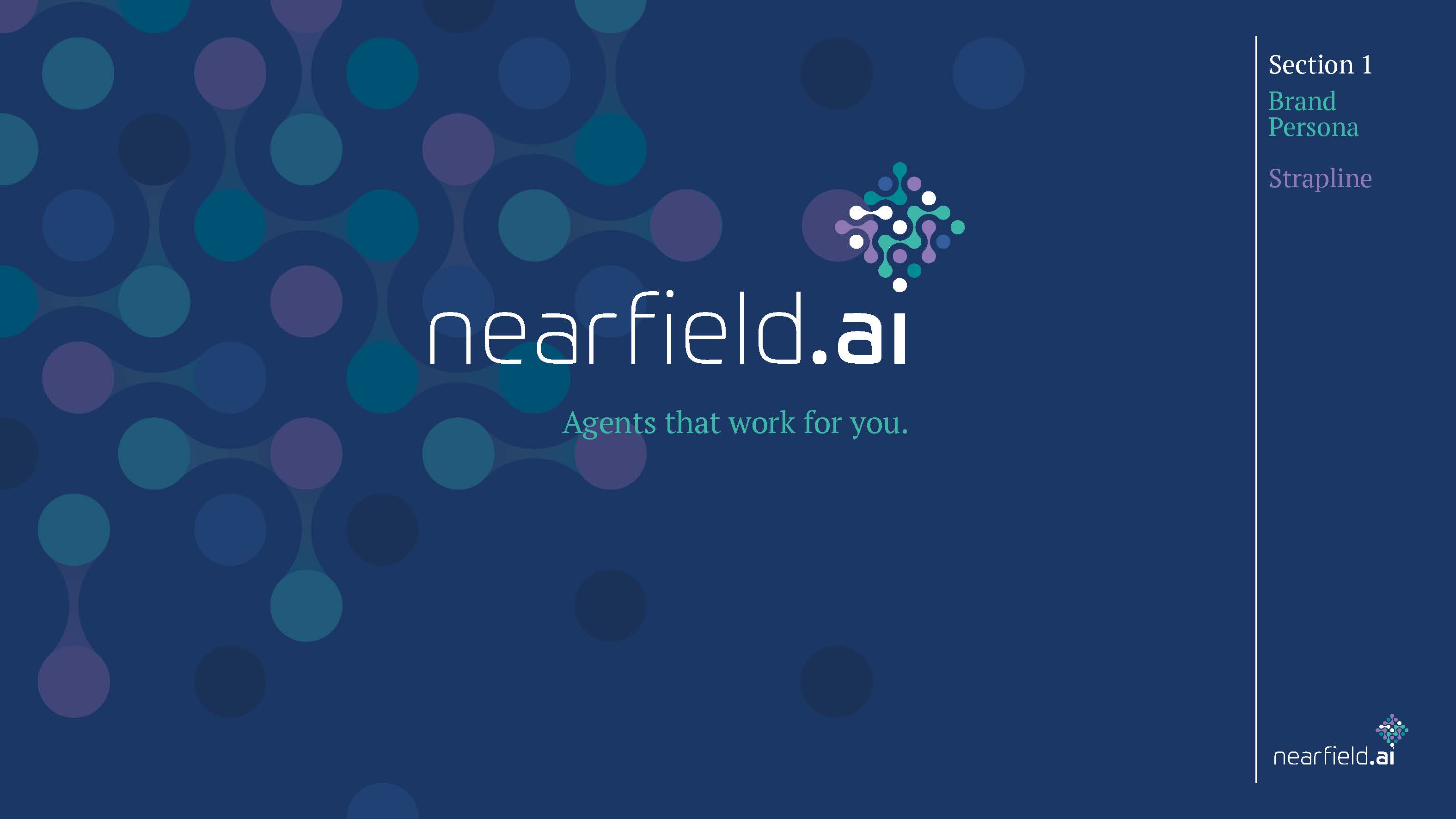
He also started to question the fonts, which brings us back to the question of the use of serif fonts - after an admittedly long preamble. The logo itself (as seen below) used a customised version of the Univa font for the company name, which is a modern sans serif font with rounded corners in each letterform for a contemporary feel. This was accompanied by an icon of interlinked dots to suggest connections, networks and synapses with the dot of the ‘i’ in ‘ai’ being at the base of the icon in which the dots collectively formed a square rotated to 45 degrees which all sat together very neatly.
The bone of contention was the use of a serif font [PT Serif] as the secondary font. Now the combination of sans serifs with serifs is well trodden path for designers, as they compliment each other well. In this scenario the sans serif font used for the company name gives a very modern and ‘techie’ feel with the serif secondary font adding gravitas. We argued long and hard that this combination created a good balance of technology and business.
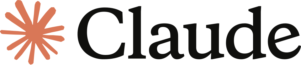
It’s interesting to note that other tech businesses use serif fonts in their brand identities with a shift towards a more analogue style, which is perhaps something of a surprise in AI. For example, one of the leading AI developers Claude uses a serif font and a hand drawn icon. AI and tech brands are reaching for the warmth and familiarity of serif fonts creating a look which is even a bit retro, bringing to mind those Apple ads of the early 2000s.
![]()
Serif fonts are traditional, they feel more human and even a tad intellectual as they’re more widely used in academia and in books. Using serfis also allows tech brands to to differentiate themselves from other tech companies whose brands are dominated by sans serif fonts - Helvetica, Grotesque, Avenir, Humanist, Futura etc. Using serif fonts in digital brands could be seen as somewhat contradictory, but all the other sans serif ones can all feel a bit ‘samey’. The drive for differentiation is causing designers to reconsider serifs.
Serif fonts also feel that bit more trustworthy, because of their legacy. When was the last time you heard about an 80-year-old cybercriminal? Things that are old and remind us of age are usually considered wise or trustworthy. The origin of the serif pre-dates printing by more than a thousand years - think about Roman capitals carved into stone. Whilst typographers have modified the letterforms over the centuries, they persist. They’re old and they’re a trusted part of typographic history.
“AI is the very cutting edge of technological frontier, yet it’s increasingly framed with serif typefaces—typography associated with age, authority and trust. It’s like a child in a three-piece suit. The machines themselves cannot yet grasp the art, craft and local nuances behind the letterforms they’re borrowing. It’s only a matter of training and time. The machines haven’t been trained (or trained themselves) on the highly specific body of typographic knowledge and cultures from the last six centuries. This century has focused unprecedented attention on typographic form—ushered in by desktop publishing and font menus in the last century; abetted by type on the web and social media; and supercharged by readily-available tools and training for making and using fonts. We’ve gone from a scant number of typographers in the world to everyone as a de facto typographer.
Type and tech experts are actively teaching AI about the components of the typographic ecosystem: how type is known, studied, categorized, quantified and understood; how type is designed and conceived; how fonts are crafted; how fonts and typefaces are marketed, discovered, and licensed by designers; how fonts become part of brand guidelines and governance systems; how fonts are used in design, layout, and production; how fonts are embedded in digital products like websites and apps; how the effectiveness of brand design and typography is judged and quantified; and the triggers for a re-brand.
In more fundamental terms, typography is the study of type, the making of type, the distribution of type, the use of type, and the effect of type. It’s by addressing these components individually and in concert that type and tech experts are helping AI see typography and render it with greater fidelity and nuance.”
Charles Nix, Senior Executive Creative Director at type foundry Monotype,