
It’s probably easier to start by talking about bad design as it makes the question of what is good design more obvious. A lot of really good design passes us by because it’s unobtrusive - it does it’s job so well you hardly notice it’s there?
Which is the point really.
Bad design hits you, sometimes literally, in the face. I recently cracked my kneecap getting out of a seat on a train on a completely unnecessary lump of plastic on the back of the seat in front in front of me, to make matters worse it was a busy train so I had to hold back the swearing and pretend it didn’t really hurt. But it did.
And I frequently find myself in a fight with really bad packaging design, such as those impenetrable blister packs that need a pair of scissors to make any inroads at all and then, when you finally get an opening and start to tear the pack apart, you cut your fingers on the sharp as glass edges. Ironically this includes surgical dressings packs.
Then there’s bad user experience design that can literally leave you screaming at your monitor - those mind-bending infinity loops of entering emails and passwords that either lock you out or don’t recognise your email address but then won't let you reset the password because it says you already have an account? I’ll stop now as I appreciate this is turning into a rant. Suffice to say that bad design leads to frustrated users and a terrible brand experience.
So what is good design?
It sounds fairly self-evident but the most succinct definition I’ve found is that “design is a field where we understand, communicate with and enhance the world around us, particularly by improving people’s lives.”
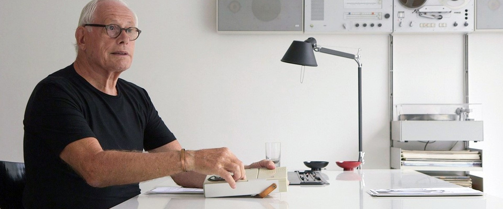
One if its leading practitioners, from a product design perspective, is the legendary Dieter Rams, a German industrial designer renowned for his less-but-better approach to design seen in his work for Braun for example.
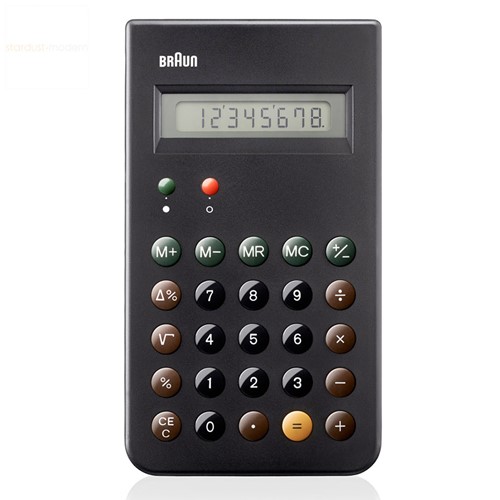
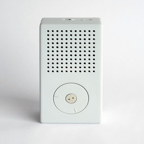
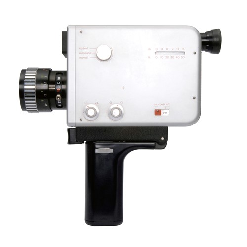
From alarm clocks to toothbrushes, coffee machines and far beyond, his approach is far-reaching and has shaped how consumer products, especially electronics, work and look today. In fact you can see his influence in Jonny Ive’s designs for many Apple products for example, which adopt his aesthetics of restraint and simplicity.
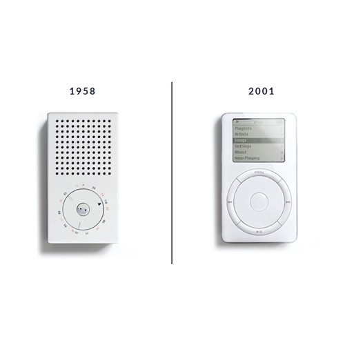
Going back to the 1970s, Rams looked at the world around him, finding “an impenetrable confusion of forms, colors and noises” and challenged himself with the question: “Is my design good design?” He defined his approach into ten principles.
Is it innovative?
Design needs to keep moving alongside developments in technology because the world is always progressing. Technological developments offers new opportunities for innovation in design and better ways of doing things. It’s important to innovate and keep up with developments that offer improvements - as long as it’s not just change for the sake of it.
Is it useful?
Form should follow function as products and services are bought to be used. Users want good experiences, or at least be spared from frustrating ones. A design’s usefulness means that nothing should detract from that.
Is it aesthetic?
Good looks and sensations are essential. Functionality is vital of course, but design should also delight the user because the products and services we use every day affect our personal well-being. A design that is well crafted will be enjoyed by users all the more when it’s beautiful, and it will make them value and want to use it more often.
Is it understandable?
If a design can be used without the user having to stop and think, it’s instantly user friendly. An intuitive look and feel will instantly inform users what to do with any product, so design should communicate clearly and intuitively.
Is it unobtrusive?
This comes back to the objective of form following function and not being pretty purely for decoration’s sake. Design serves a purpose which is why a neutral and restrained approach generally works best; keep it as clean and simple as possible to help users.
Is it honest?
As users and consumers we naturally want the promises that are made to us to be kept. We want the product to do what the brand says it will do, it’s why we bought it after all. So no false hopes or exaggerated claims as this will lead to disappointment and most probably a lost user.
Is it long-lasting?
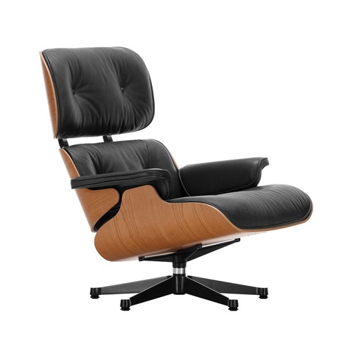
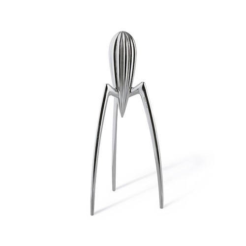
Good design never looks out of date. Classics like the Charles Eames chair or Philippe Starck’s lemon squeezer always look good. Clean design and avoidance of trends helps prevent the kind of styling that ties a product to an era and makes it date and become discardable.
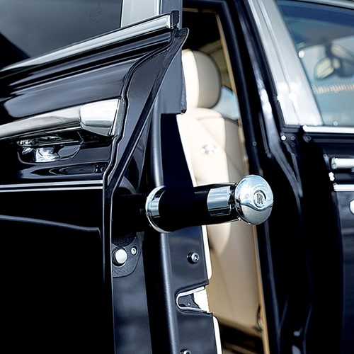
Is there attention to detail?
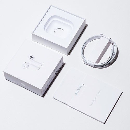
Fine details make all the difference. By paying attention to the smallest elements it lets users know that the design is really considered and cared about. The delight is often in the detail from the simple things like the way Apple packs a cable, to the luxury of a Rolls Royce umbrella hidden in the side of the door.
Is it environmentally friendly?
We’re all increasingly aware of the need to protect the environment, so thinking about designs that can be recycled more easily, used for multiple purposes, maintained or repaired easily rather than replaced, and made with less resources is vital.
Does it involve as little design as possible?
The least possible is usually the best possible. When you focus on just the essential aspects in your design, you can make the best of their purity. For example, the clean feel of a UI with well-defined, simple buttons is a winning “formula” compared with the clutter of options users would experience if you inserted every nice-to-have feature.
Good design is user-led, intuitive and self-explanatory. It’s about ‘less is more’ thinking with an acute attention to detail that delights those users who will appreciate that you really understand them and their needs.
“You cannot understand good design if you do not understand people.” Dieter Rams.