First impressions count for a lot in most walks of life and this is never more true than online as you only have a few seconds to create a positive impact because the next site is but a click away. Here are half a dozen quick tips on the key design factors that affect how users will view your site to help keep them engaged. To try and make sure the Ui design of your ecommerce site is turning users on, not away.
Clean and clear interface design
It sound obvious but naturally people prefer to browse a visually pleasing website and when it comes to design, less is more. Use white space to bring balance and let your content breathe. Don’t try and cram everything into that first section on the home page or bombard them with sales messages. Try to think about your home page as if it’s your shop front - you wouldn’t put everything you sell in the front window? Use it to feature key pieces, with strong imagery to try to draw them to the site and scroll down the page.
Usability
Intuitive navigation is critical to a good website with more than three quarters of consumers saying that not being able to quickly find what they’re looking for in a site is their biggest frustration. There are now many accepted norms in web design that are hard, or very risky to ignore, for example the sopping basket is always positioned top right. This isn’t an immutable law of course, but if you position it somewhere else you need to accept that it’s going to annoy lots of users. Navigation needs to be really clear and obvious and in a position so it’s easy to find – techniques like using ‘sticky navigation’ so it stays anchored are really useful. How the navigation actually works is important of course – overly complex mouse down and across rollovers in hero drop downs can be frustrating where the rollover area is too small. Try to follow the tried and tested rules of Gestalt [a theory which proposes that our brains are ‘hard-wired’ to recognize images in certain ways] such as the ‘focal point’ principle by using a bright or contrasting colour or shape to draw the eye, typically the ‘add to cart’ button. Don’t forget to include a search to allow your customers to immediately find what they’re looking for without even using the navigation. Remember that the next site is just one click away and that half of customers don’t’ buy simply because they can’t find what they’re looking for.
Good quality images
It might be a cliché, but it’s true, a picture is worth a thousand words with a recent Forbes survey showing that 75% of users said that great photos influence their buying habits. The same survey highlighted that over 60% of buyers said multiple camera angles also influenced their purchasing decision with a mixture of distances and a zoom function. It stands to reason really, whether it’s ate shirt or a sofa, you want to see how it looks from all angles, zoom into the fabric and features. So the investment in good photography pays off and it’s best thought about in relation to the value of the item, how many do you need to sell to get payback? As well as good photography, there are an increasing array of more sophisticated visualization tools to help the user, such as AR where you can drop that sofa into your own lounge to see how it will look in situ, and we’ve recently implemented a configurator tool into Allermuir.com which allows users to change colours and finishes of products before viewing from any angle.
Frequent calls to action
Ultimately you want users to engage – to buy, to order, to enquire, to download – and this needs prompting with clear CTAs [calls to action]. Again, use Gestalt’s focal point principle to attract the user’s attention to the ‘click here’, ‘enquire’, ‘learn more’ or ‘add to cart’ buttons but don’t make your site look like a Vegas slot machine and bombard the user with too many CTAs as it will just confuse them.
Consistent branding
Consistent branding is an accepted best practice rule for all marketing – just look at the big players like Nike, Apple, Coca Cola and so on, they’re biblical about how their logos and brands are presented. You want to build recognition of your brand through cumulative impact so your website should reflect your company’s brand style to reassure users they’re in the right place. You should aim to deliver a consistent brand experience across all your online and offline channels from the logo, colourways, fonts and image treatments/styles on to the strapline, messaging and tone of voice right through to the order confirmation email templates and packaging the product arrives in.
Responsive design
Mobile now accounts for more than half of all internet traffic and 54% of all ecommerce transactions are forecast to be via mobile by 2021 so it’s important your site displays well across all devices. While most websites are now mobile-friendly, it’s also important to consider the load times as most people expect pages to load in two seconds or less - if it’s slower the probability that the user will click away increases massively. Mobile is important for search too and Google promotes Accelerated Mobile Pages [AMP] which are essentially stripped down versions for mobile with faster load times. You can improve load times by looking at the size of the site’s images as large image files will slow the site down, compressing images and text can help 25% of pages save more than 250KB, boosting load times.
Summary
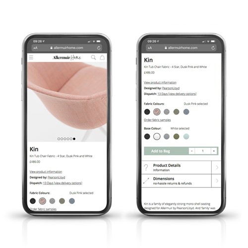
These tips will all help improve your website design and create a better user experience which will ultimately pay off with more users and sales. Below is a site we’ve recently designed and developed for Allermuir Home which demonstrates these in practice, see www.allermuirhome.com