
London based DesignStudio are one of the world's leading branding agencies having developed brands like Airbnb, British Airways, The Champions League and Premier League to name but a few. Their recent refresh of the AO brand is one of those pieces of design work I suspect the Daily Mail could possibly pick up on and condemn as an outrageous waste of money - not that I've any idea how much it cost but presume a big client and London rates equals a big bill! I can imagine a headline along the lines of 'Can you spot the difference?!? AO spend 10 Million quid for an 'Emperor's new clothes' logo. What a waste of money". However, the apparently small changes in the redrawn 'smile' logo make a big difference.
The rather clunkily named 'Appliances Online' was founded in 2000 in neighbouring Bolton by visionary electrical salesman John Roberts later rebranding as the much snappier 'AO.com' in 2013. This was followed by a very successful flotation and the company has gone one to become the UK’s largest online-only retailer for home electricals and appliances. The AO brand featured a friendly smiley face logo and the memorable 'AO. Let's go' jingle lifted from the Ramone's song 'Hey! Ho! Let's Go!' at a no doubt eye-watering cost. These quickly became recognisable elements of the brand playing an important role in AO's growth.
The company obviously decided the brand was becoming a bit tired and that it was not getting across the “distinct AO personality” of the brand, so they approached DesignStudio for a “long overdue facelift”. The new look they've designed for the online electrical retailer includes a redrawn 'smile' logo, a refreshed colour palette and a custom typeface in a bid to create a better “emotional connection” with customers and convey the brand’s "warmth and personality" as distinct from its competitors.
The first part of the project was to bring the smiley face logo into the present day and to optimise it for digital environments, according to DesignStudio's design director Elise Santangelo:
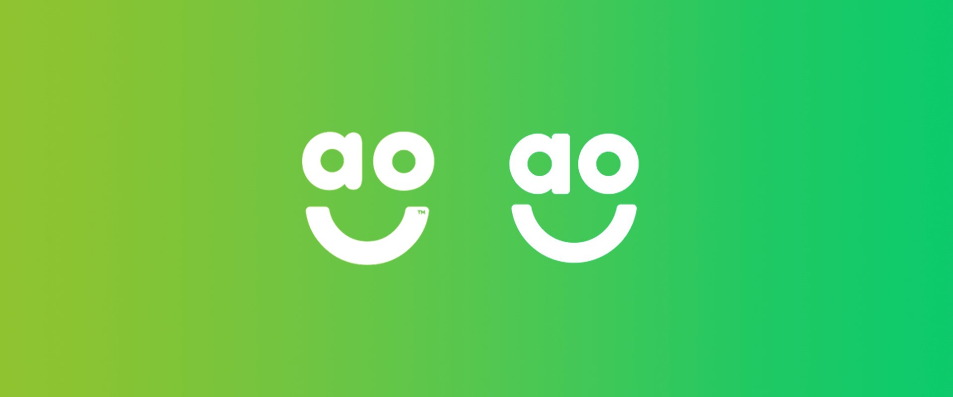
“The logo was awkwardly drawn – the smile was too chunky, and the elements were uncomfortably spaced,” she says. “It was difficult to centre and didn’t sit comfortably in a square.. It felt like there was a disconnect in styles between the “bubble ends” of the ‘a’ and “rounded ends” of the mouth."
Previous version.
DesignStudio have redrawn the logo to address these issues by subtly cleaning up the curves and spacing which helps balance the elements much better allowing them sit together more comfortably on a new, fresher background green. While the differences may seem minimal, they really make a big difference.
2020 version
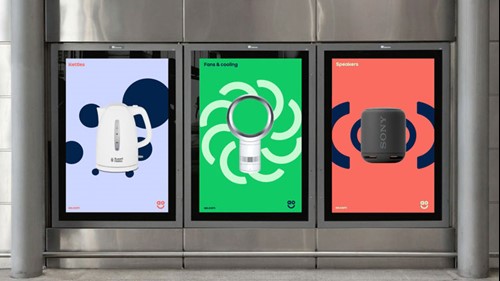
The refreshed smiley face graphic and its elements have then been used to create further branded elements in a series of 3D and digital graphics drawn from the logo as Santangelo explains:
“Using these shapes, we created brand patterns and product category graphics, which helped give AO some much needed energy across even the simplest of application. We created a set of icons based on the same radiuses and curves, which are responsive to the digital environment they needed to live in.”
The brand refresh is part of a new 'Always On' strategy that AO brought to DesignStudio initially and aims to better reflect the personality of the brand and the fact it is always there to help its customers no matter what time.
As well as the series of patterns, graphics and animations, a new custom typeface, or "smileface", as the studio slightly cheesily calls it, has been created and the brand is supported by a more vibrant colour palette.
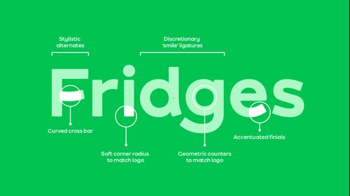
“It’s fun and its quirky and we just thought it would give AO an extra punch, especially for touchpoints that were just a headline,” Santangelo says.“At the end of the day, AO is selling fridges and toasters which aren’t always the most glamourous of products, so we had to find a way of evoking an emotional connection another way. The end result is a “functional toolkit” which the AO team can make work for them to become a “beloved brand, rather than just a go-to business.”
These kind of creative challenges are often the most intellectually stimulating for a designer. AO is obviously a very successful company and the brand identity has played a big part in that success, so it would be commercial suicide to make drastic changes to the brand and risk losing any of the carefully built up perceptions of it. Equally there's always room for improvement and sometimes a strategic business need to evolve or demonstrate change. Whilst DesignStudio's refresh of the AO logo is subtle, they have, without doubt, improved it with the elements being much better balanced highlighting how awkward the former version looks in comparison. Again it may be subtle, but the new typeface echoes this beautifully although admittedly you may need a typographer's eye to appreciate the finer details. Finally, the bold use of the graphic elements and distinctive colour palette looks like it will make for some really strong creative going forwards.
See the whole project here: https://design.studio/work/ao